Monday, 21 January 2013

Rough Speed practice (15 mins)


Inspired by the compilation of concept art images I posted earlier on


Colour and Stroke practice

Outline of building, filled with a light mud colour with a directional arrow to show where the light will be coming from

Adding shading and a different colour for the roof of the building, using different shades on the colour palette and a low opacity on the brush.


Continuing with low opacity brush strokes, removing the outline and making it look warmer with a rich gold shade.

a few more minor details to finish it off (roof still needs finishing)

Inpirational Concept Art

Concept Art - Rayman Origins - What I love about this concept art is that it is very stylised yet consistent, and it uses this style throughout the game. Quite minimalistic and has a very nice use of colour schemes, to create a believable, beautiful environment.
Concept Art - Star Wars: The Force Unleashed - Very nice brush strokes in this piece of concept art, also showing a contrast between the very vibrant red and orange colours and the grey colours to create more depth.
Concept Art - Star Wars: The Force Unleashed - Very nice brush strokes in this piece of concept art, also showing a contrast between the very cool, ice blue colour and the brown, yet quite brighter half of the picture.

This concept art caught my eye and i'm not sure why. I'm quite into the oriental type of architecture and environments, but also the warm feel to this makes it look very special. It has used various shades of the same mud type colour to create the whole drawing which I think is incredible... There are also a good displayed of Brush Strokes in this, especially on the mid-ground and background buildings.

Concept Art - Dishonored - Beautiful piece of concept art, making full use of simple brush strokes throughout the whole piece even in the focused, detailed area such as the bridge. I want to produce something of this quality for my pei


Concept Art - Assassins Creed - Fan Art - Tremendous piece of concept fan art to create an oriental setting for an Assassins Creed game... Both of them show a beautiful looking atmosphere even from different angles, time and setting. Looking close, there is little detail on the buildings or even the characters in the scene, yet the brush strokes have been done so well that it doesn't take anything away from the picture.
Concept Art - Guild Wars 2 - Very sketchy style of painting, using very harsh, sharp strokes with consistent, quite vibrant colours.


Favourite Film and Video Game Characters (Inspiration)

Cloud Strife - Final Fantasy VII - Mysterious, gloomy and depressed but still has a strong heart and a great soldier.

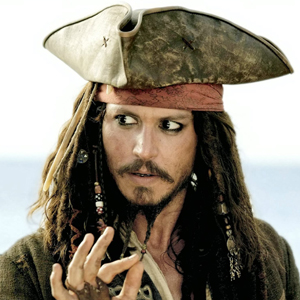
Jack Sparrow - Pirates of the Caribbean - Scruffy style, mad, Inspired by Keith Richards' drug image

Ezio Auditore - Assassin's Creed II - You find out so much about this character across three games, and can relate to him straight away from the first couple of missions played in game. Strong heart, loving and a great assassin.

John Marston - Red Dead Redemption - Favourite character form a video game. Mean, tough guy but with a very strong heart who cares so much about his family.

Raoul Duke - Fear and Loathing in Las Vegas - Drug addict base don Hunter S. Thompson, looking to see if the American Dream is still out there.

Nico Bellic - Grand Theft Auto IV - Amazing character, seeking revenge in America.

Rayman - Inspiration style - Superhero, cartoon.

Roxas - Kingdom Hearts II

Sonic The Hedgehog

Spyro The Dragon

Rubi Malone - Wet

Vaas Montenegro - Best Villain ever. Sarcastic attitude.

Tifa Lockhart - Final Fantasy VII

Bilbo Baggins


"Even the smallest person can change the course of the future"

Tuesday, 15 January 2013

Character Analysis (not mine)


I feel that this diagram will work as a basic diagram for my Character Design role. It includes a lot of factors that I will have to think about, I will use this as a template to write about the back story of each of my characters, but I would also like to add quite an in-depth history of each character too because I feel that is what really shapes them.

Guild Wars 2 - Inspiration Concept Art

Guild Wars 2 concept art sticks out in my mind more than any other... I feel like every piece of concept art on there website looks incredible, I'm not sure why... maybe it's the fantastic use of colour; either using a colour scheme which is made up of different shades of red throughout a whole piece... Or making something really vibrant out of a vast range of colours, each working tremendously well. The Guild Wars 2 concept art is definitely what I aspire to be as good as, and I hope by the end of this I have a piece of work that will be able to contend with theirs.


Inspirational Concept Art


These four pieces of concept art, really have a nice; gritty, gloomy mood to them which is something that I think the environment I have in mind would look like... They are quite dull colours, but the shadows and lighting really bring them to life and make them look beautiful.

The first two pictures are concept art of Assassins Creed III. I think they have a similar to environment to one that I have in mind, so i'm going to keep them in mind whilst doing mind and hope to find similar ones to give me even more inspiration.

The bottom piece looks absolutely incredible. The lighting is perfect and really works well with the style of interior. This is also a style I have in mind for my own concept art, at least it does if I end up doing the inside of a building.

The Art of Glen Keane - Research

Pocahontas - Character Development
These sketches in the development stages I feel are essential... It really gives you a chance to notice the flaws in your character and to determine how they'll look in certain poses, from the positioning of their body parts to their minor facial expressions.

Ariel - Character Development
Ariel is a quite an odd case for a character design because she is part human, part fish... (a mermaid)
This must be quite challenging to decide how the body should look even in stationary poses, I feel that it is a great idea to point out and write the improvements you have made, and will make to get the perfect body shape.

Beast - Character Development
Quite a simple sheet but it shows a few of the different ideas that Glen Keane had drawn before coming up with a definite choice of what the Beast should look like.

Research/Inspiration - Character Sheets

Eladrin - Character Sheets
I believe this is fan art of an Eladrin, a race from the Role Playing Game; Dungeons and Dragons, but I think this is a great example to show off the front and side view of the character to see the full profile of them
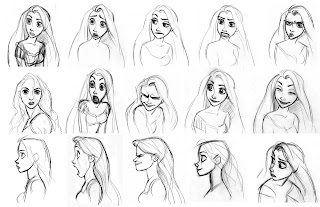
Rapunzel - Facial Expressions
These sketches are amazing, and I think they are essential in character design because they show so many different emotions and really help you get a feel of how the character looks in different situations and even acts.

Flynn Rider - Facial Expressions
These sketches are amazing, and I think they are essential in character design because they show so many different emotions and really help you get a feel of how the character looks in different situations and even acts.


MOODBOARD

This Moodboard contains a collection of images that inspire me. Maybe towards the look of the characters, or the feel of the enivronment I would like to create a concept art of... I love the smart, yet scruffy look of all of these men... It gives it a gritty, old western type of feel. I added the photo of the cat because I thought it'd be different to maybe make the characters as cats in human clothes, with human attitudes to tell a story similar to Animal Farm by George Orwell.
Moodboard for Style and Mood.